Start with the textiles you already have
Before choosing another cushion or throw, look at the largest textile surfaces in the room. A rug, upholstered sofa or set of curtains takes up more visual space than a small accent pillow. Treat these pieces as your starting point, even if they are neutral. A woven cream rug, for example, may have warm undertones that sit more comfortably beside rust and olive than icy gray.
Choose two or three colors to repeat across the room rather than asking every textile to introduce something new. One can be a quiet base color, another a supporting shade and the last a smaller accent. The colors do not need to match exactly: a pale blue stripe and a deeper blue floral can belong together when other elements, such as the fabric weight or background color, connect them. Repetition helps a collection feel intentional without making it look like a matching set.
Give each pattern a different job
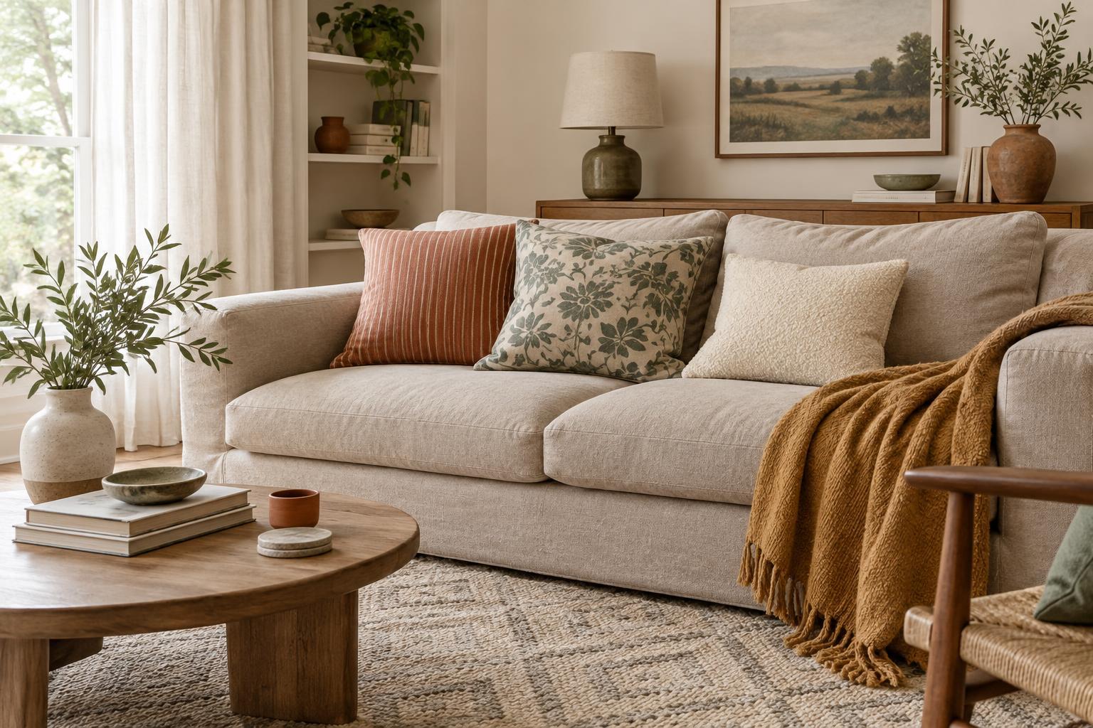
Mixing patterns becomes easier when they vary in scale. If the rug has a broad, expressive motif, try a medium stripe on a cushion and a small check on a chair pad. Patterns of similar size can compete because they ask for attention in the same way. A large, a medium and a small pattern usually give the eye a clearer path around the room.
Vary the type of pattern as well as its size. A loose botanical print can sit beside a regular stripe or geometric weave because their rhythms contrast. Look for one shared color to link them. You do not need to use every pattern everywhere; a single patterned curtain panel can make enough of a statement when the upholstery beneath it is calm.
Solids count as part of the mix. Place a plain cushion between two printed ones, or let a simple throw soften a lively upholstered chair. Even fabrics described as solid may have subtle variation: linen, boucle and textured cotton bring depth without adding another obvious motif.
Leave space for the eye to rest
A room can contain several beautiful textiles and still feel busy if every surface is covered. Leave some stretches of sofa, bedding or tabletop visible. This gives each patterned piece room to be noticed. If a rug and curtains both make strong statements, fewer cushions may be more effective than an elaborate pile.
Pay attention to contrast, not just color. A black-and-white print tends to stand out more sharply than a print in two closely related shades. To calm a room without removing its personality, keep the boldest contrast to one or two places and let nearby textiles use gentler color changes. A patterned rug with soft, muted colors may feel quieter than a small cushion with a striking graphic design.
Step back and look from the doorway. Notice where your eye lands first and whether it can move easily to the next area. If everything seems equally prominent, take away one patterned item or replace it with a solid. Editing is often simpler than searching for the perfect additional piece.
Use texture to add interest quietly
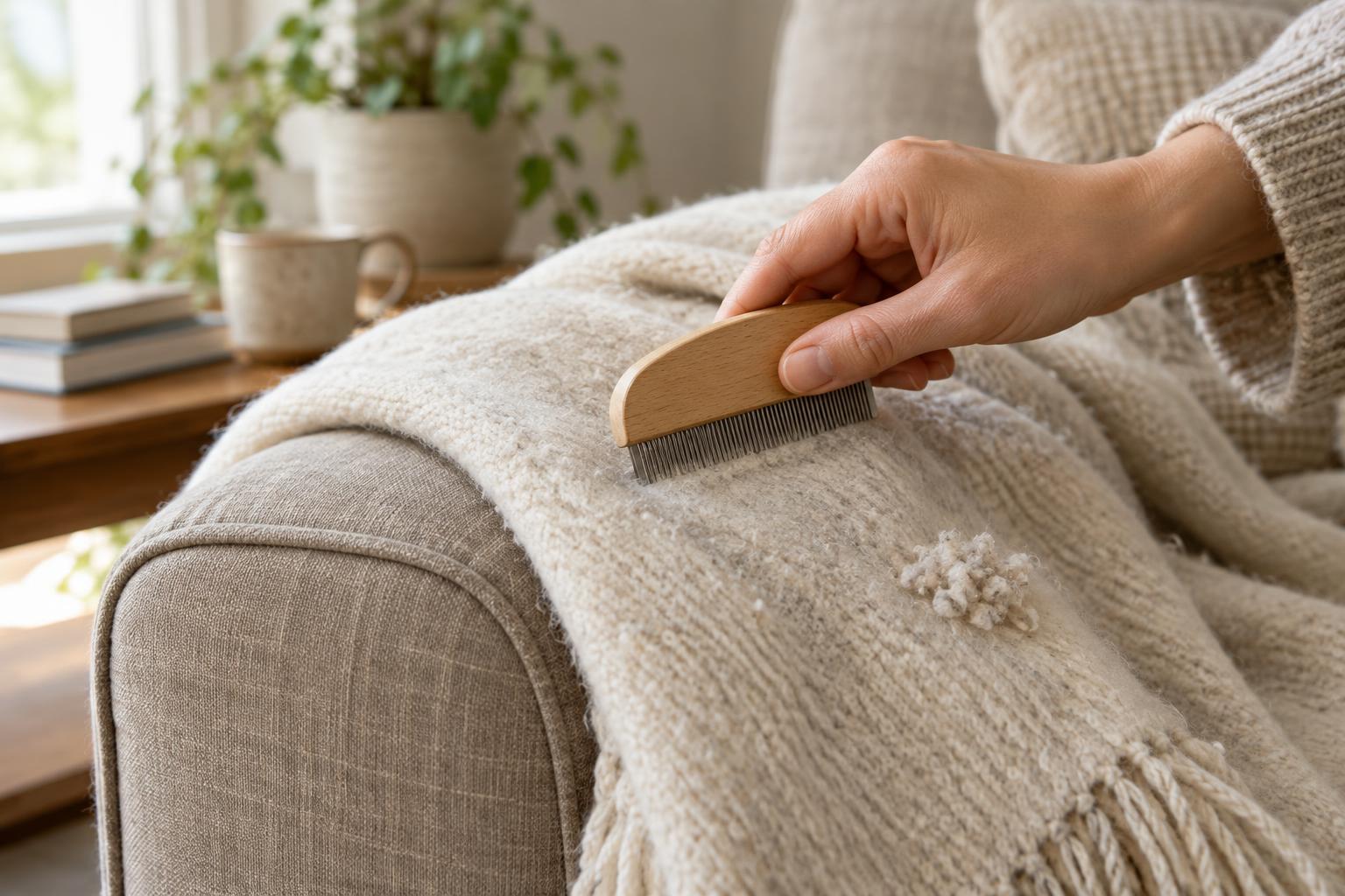
Texture makes a restrained palette feel layered. A smooth cotton cushion, a nubby wool throw and softly draped linen curtains can each contribute something different, even when their colors are similar. This is especially useful if you enjoy a calm room but do not want it to feel flat.
Consider how fabrics sit next to one another. A chunky weave can balance a fine print, while a crisp stripe may benefit from the softness of a brushed or slubbed fabric. You can also repeat a material in small ways, such as pairing a linen cushion with linen napkins in an adjoining dining area. The connection is subtle, but it can help rooms feel related.
Choose textiles for how they will be used as well as how they look. A decorative layer that constantly needs straightening or cannot handle everyday life may make the room feel less relaxed. Keep frequently used pieces comfortable and practical, then reserve delicate fabrics for places where they will get less wear.
Build the mix one layer at a time
If you are uncertain, begin with the largest pieces and add smaller textiles gradually. Lay a possible cushion cover or throw near the rug and curtains rather than judging it on its own. Look at the combination in the room’s usual light, since colors and textures can appear different there than they do elsewhere.
There is no required number of patterns. A room with one print, two solids and several textures may feel just as considered as a room with three different motifs. Aim for a balance that suits the space and the way you use it. When the palette has a few repeated colors, the patterns have distinct scales and some surfaces remain quiet, the result can feel layered without feeling crowded.