Choosing furniture by appearance, not by fit
A generous sofa may look inviting on its own but dominate a modest living room. At the other extreme, several small pieces can seem adrift in a spacious room. The mistake is judging each item separately instead of considering the space it occupies alongside other furniture, doorways and walking routes.
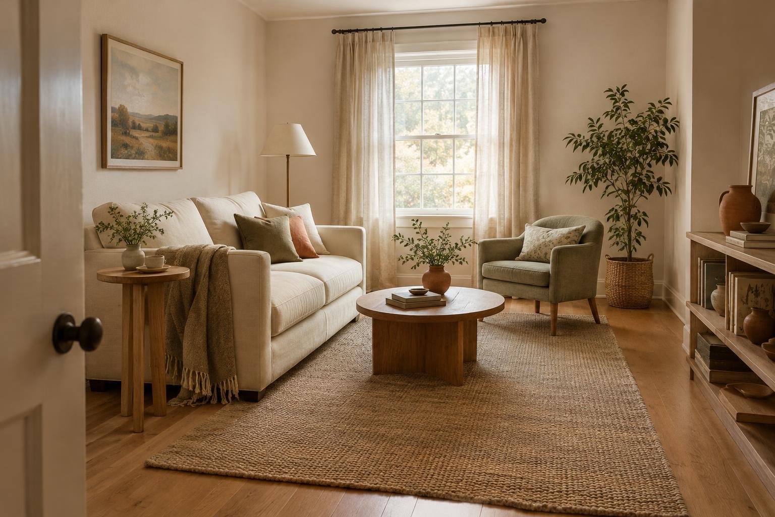
Before moving in a large piece, mark its footprint on the floor with removable tape or sheets of paper. Check whether you can move comfortably around it and reach nearby storage without awkward detours. If a room already feels crowded, try removing one occasional chair or side table before replacing the main furniture. If it feels sparse, bring existing pieces closer together to form a useful conversation area rather than pushing everything against the walls.
Letting the rug sit apart from the seating
A rug can visually connect furniture, but a small rug stranded between a sofa and chairs often does the opposite. It draws attention to the empty floor around it and makes the seating group appear fragmented. A very large rug can also flatten a room if it covers nearly all the visible floor without leaving a clear border.
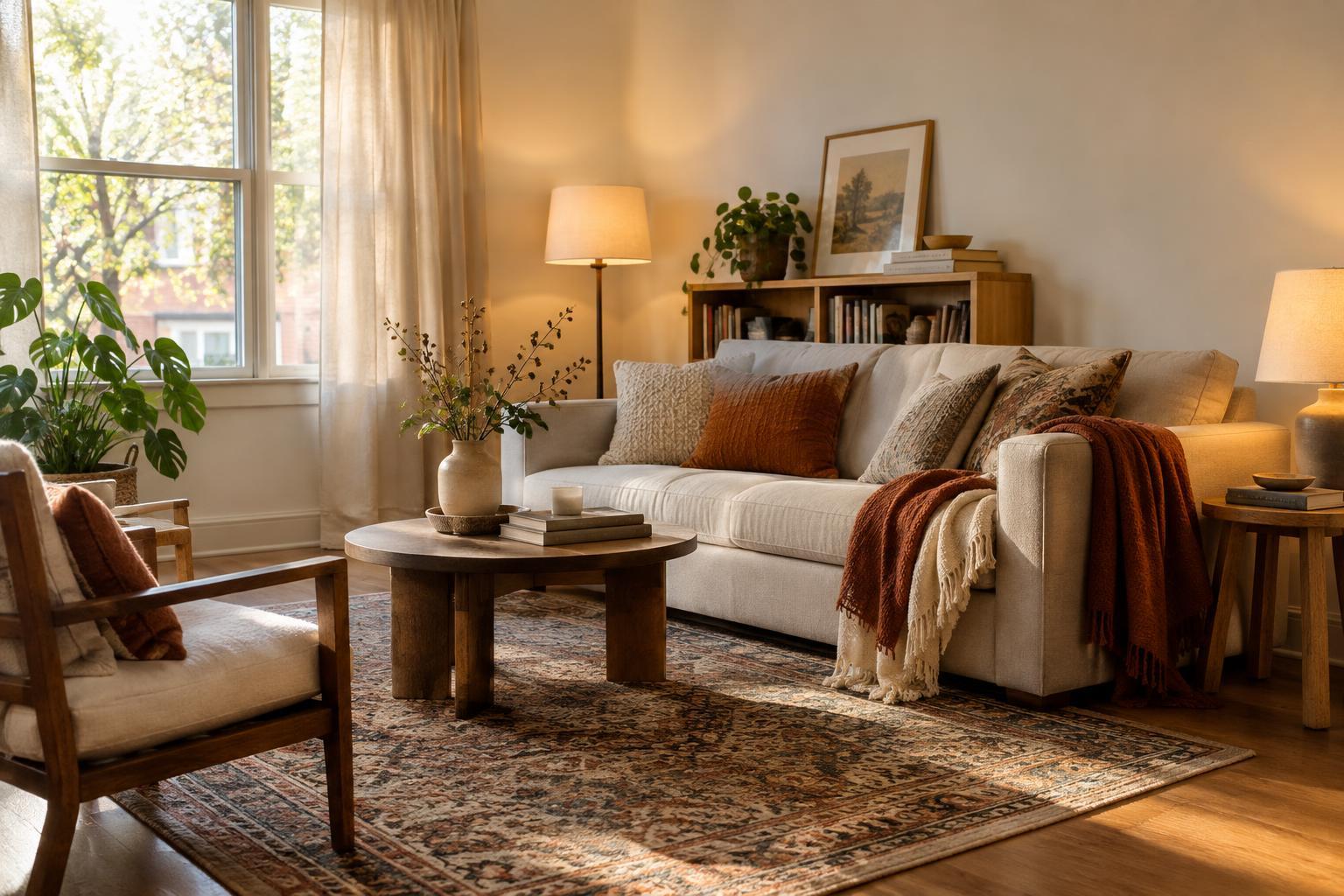
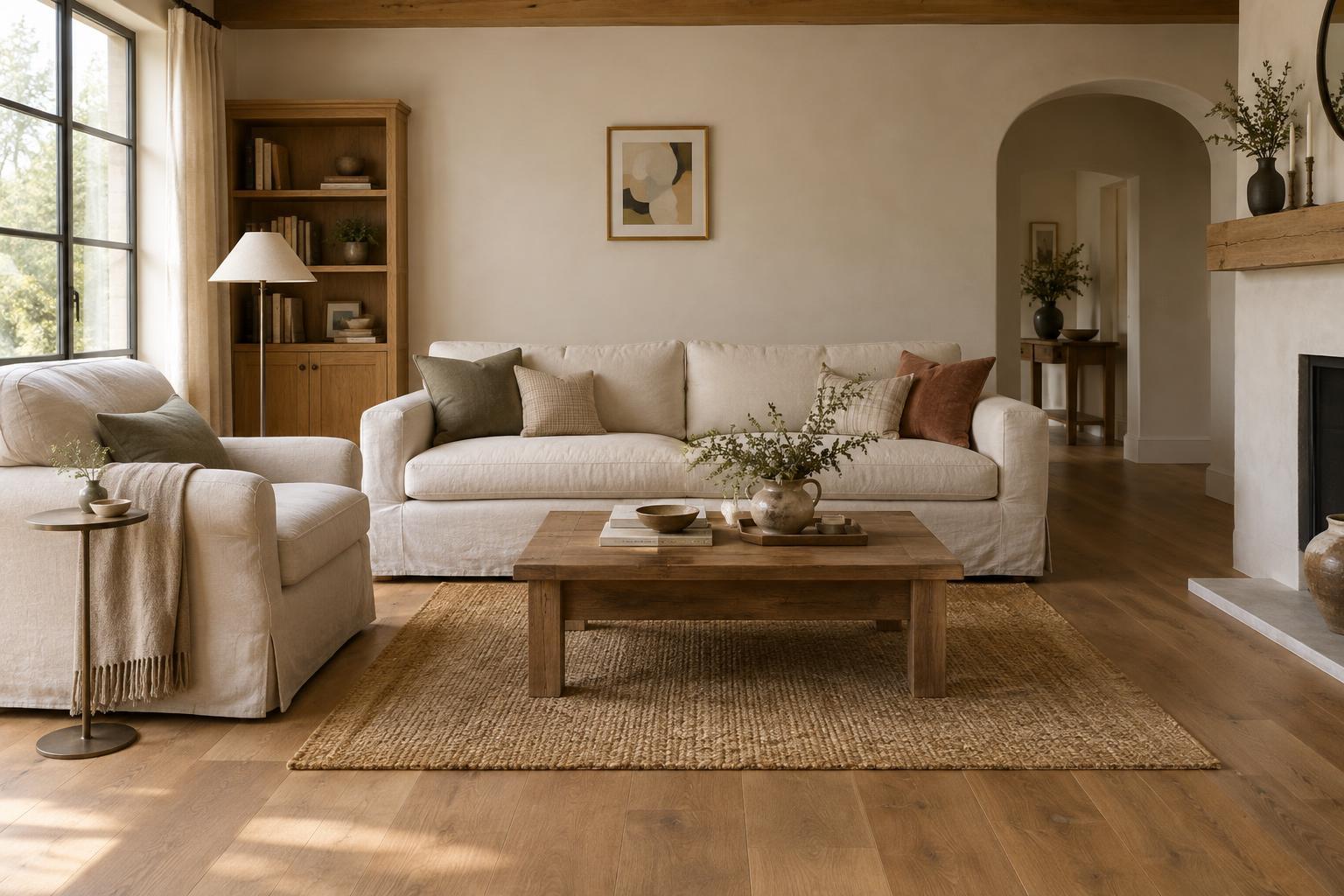
Start by deciding which furniture the rug is meant to unite. In a living room, a rug that extends beneath the front legs of the main seating often gives the group a more settled look. If the rug you own is too small for that arrangement, consider using it in a reading corner or beside a bed instead. Moving a rug to a better-fitting spot can do more for a room than buying additional accessories.
Hanging art without regard to what sits below it
Art hung high above a sofa or console can seem disconnected from the furniture. A tiny frame centered over a broad piece may have a similar effect, even when its height is comfortable to view. The wall, artwork and furniture need to read as a related group, not as three separate layers.
Hold artwork in place before committing to a hook, and step back to view it from the doorway and the seats used most often. Aim for a gap that makes the art feel associated with the furniture while leaving breathing room. Several smaller works can form a group with more visual presence than one undersized frame. When arranging them, treat the outer edges of the group as a single shape and keep the gaps between pieces reasonably consistent.
Confusing open space with unused space
Proportion is not only about the size of objects; it is also about the space between them. A room can feel cramped when every corner holds a basket, plant or accent table. It can feel oddly empty when all the furniture hugs the perimeter and nothing defines the center. Neither problem necessarily calls for more shopping.
Look for places where space serves a purpose: a clear path through the room, room to pull out a dining chair, or an uncluttered area beside a cabinet door. Then notice gaps that make activities less comfortable, such as a chair too far from the table that holds a drink. Keep useful open areas and adjust disconnected pieces. This distinction helps a room feel both relaxed and intentional.
Using details that compete with the room’s scale
Finishing touches can exaggerate a proportion problem. A single small lamp on a substantial sideboard may look lost, while a cluster of bulky accessories can overwhelm a narrow shelf. Curtains that end well above the floor may make a window look cut short. These details matter because they draw the eye toward edges and height differences.
Edit accessories into groups that suit the surface beneath them, leaving some of that surface visible. Consider a larger lampshade or a second light source when one small lamp cannot hold its own visually. Check curtain length in relation to the window and floor before changing the hardware. Finally, view the room from several angles. If your eye keeps stopping at one piece for the wrong reason, a small change in placement may restore balance.