Start with the room you have
A room color palette is more than a paint color. It includes the floor, furniture, curtains, rugs and smaller objects you see together. Before collecting new ideas, look at the elements you plan to keep. Flooring, tile, countertops and large pieces of furniture often take up enough visual space to influence every other choice.
Note whether those elements feel warm, cool or fairly neutral. A honey-colored wood floor, for example, may sit comfortably beside creamy whites and earthy greens, while a cool gray tile may call for a different set of companions. You do not have to match every undertone exactly. The aim is to notice what is already prominent so your new colors feel considered rather than accidental.
Choose the feeling, then narrow the colors
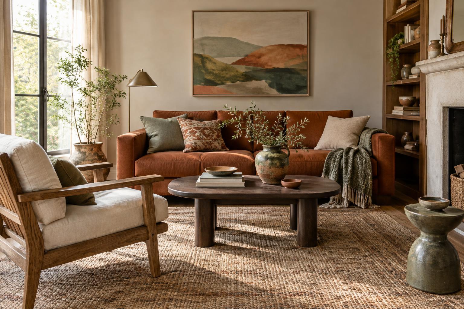
Words can be a useful starting point when a wall of paint samples feels overwhelming. Decide how you want the room to feel: calm and airy, warm and relaxed, or lively and playful. Then choose a small group of colors that supports that direction. For a warm, quiet living room, you might begin with soft cream, muted olive and a small amount of rust. For a brighter look, you might pair a light neutral with blue and a restrained yellow accent.
Give each color a role. One main color can cover the largest surfaces, a supporting color can appear in furniture or textiles, and an accent can show up in smaller pieces. These roles are flexible: the main color does not have to be white, and the accent does not have to be bold. Keeping the initial palette limited makes decisions easier. You can add nuance later through different shades and materials.
Let light and scale guide your choices
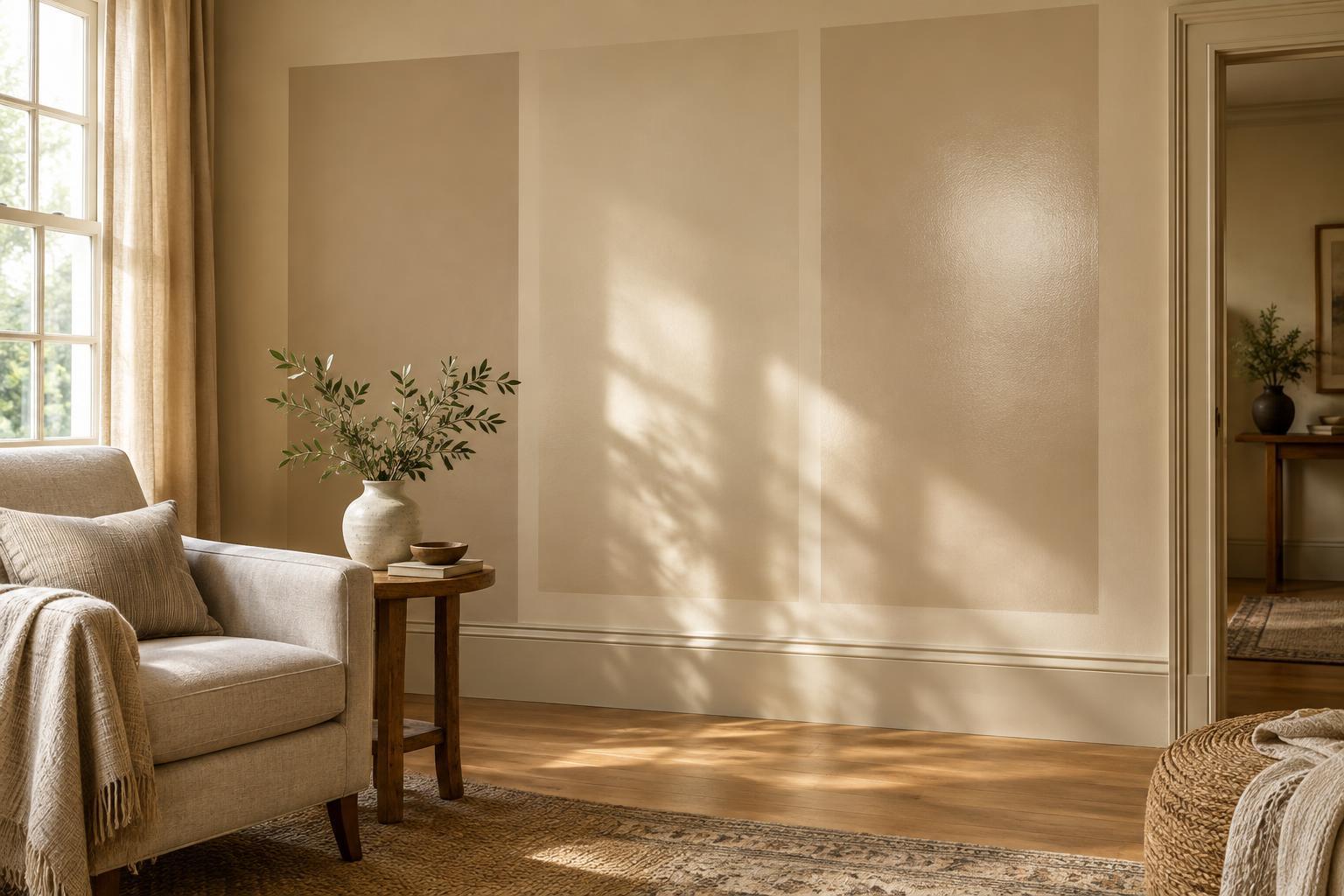
The same color can look different from room to room. Daylight, lamps and nearby surfaces all affect how you perceive it. A shaded room may make a pale color seem cooler, while warm bulbs may deepen the appearance of a beige or yellow. Rather than relying on a sample viewed elsewhere, look at your options in the room where they will be used.
Consider how much of each color you want to see. A deep blue on every wall creates a different experience from deep blue on a single chair or cushion. If you are unsure about a strong color, try it first in something easy to move or replace, such as a throw, lampshade or table linen. Conversely, if you love a saturated color and want a cozy effect, using it across a larger surface can feel intentional. The right amount depends on the room and your comfort with contrast.
Use textiles and materials to connect the palette
A palette can feel flat when every item is the same smooth finish or exact shade. Textiles give you room to vary both color and texture. A patterned rug might contain your main color and accent in different proportions, while curtains can soften the transition between painted walls and furniture. Cushions and throws are useful for repeating a color without making it dominate.
Natural materials can act as bridges between colors. Wood, woven fibers, ceramics and metal each bring their own tones to a space, even when you think of them as neutral. You do not need to buy a matching set. A few repeated details, such as a warm wood tone on a shelf and in a side table, can help varied pieces belong together. If a room feels busy, repeat fewer colors and give the eye some quieter surfaces to rest on.
Test before you commit
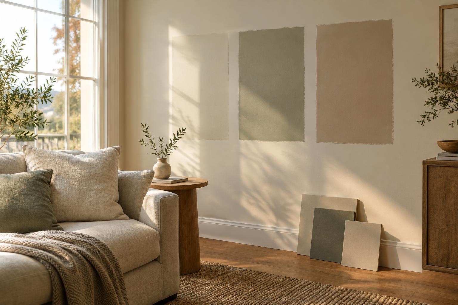
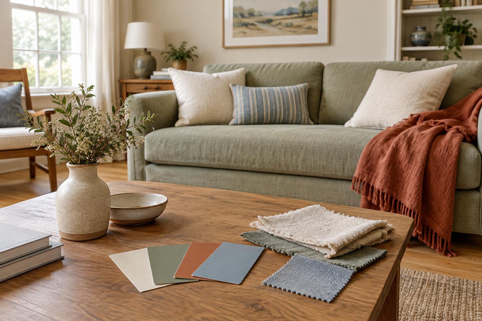
Bring your shortlist into the room and view the colors alongside the furniture and finishes that will remain. For paint, place samples on more than one wall if possible and check them at different times of day and under the lights you normally use. For fabrics, look at generous swatches near the floor, sofa or window where they will eventually sit. A tiny sample may not show how a color feels across a larger area.
Make one decision at a time. Once the main color feels right, compare supporting colors against it, then choose accents. If something seems off, ask whether the issue is the color itself, the amount of it or a neighboring material. You can adjust the balance without starting over. A successful palette is one that works with the room you live in and gives you a clear foundation for changes over time.